UX/UI Designer
MessageMail
Project Overview
CLient COnstraints
- Typography: Nunito
- Aesthetic: social media is fun – don’t make it too serious
- Pages: landing page and sign up page
Hero Section
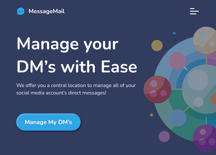
Inspired by Imagery
When I was little and auditioning for musicals and choir, my mom always told me that I needed to wear something unique or flashy to stand out from the crowd. I tend to view the hero section of a web design similarly – it has to be unique in order to grab someone’s attention and make it memorable. Imagery is one of the most powerful elements in design, after all, our eyes are responsible for most of our sensory input.
Using Recraft.AI for Images
When I think of social media messaging, the first thing that comes to mind are the little chat bubble icons that are the universal indicator of DMs. These icons are:
- Round and bubbly
- Playful
- Inviting and familiar
I wanted to capture that bubbly imagery, because it fit the client’s need for an element of fun. I didn’t want the site to look like polka dots, though, so I thought some more about how to connect the bubbles- and it hit me. Social media is about connections- so the bubbles should be connected with lines.
I used Recraft.AI to help me generate an image. Below, I have included the prompts that I used to generate them.

Best Design
A central orb that has colorful text bubbles pointing to it in a circular pattern
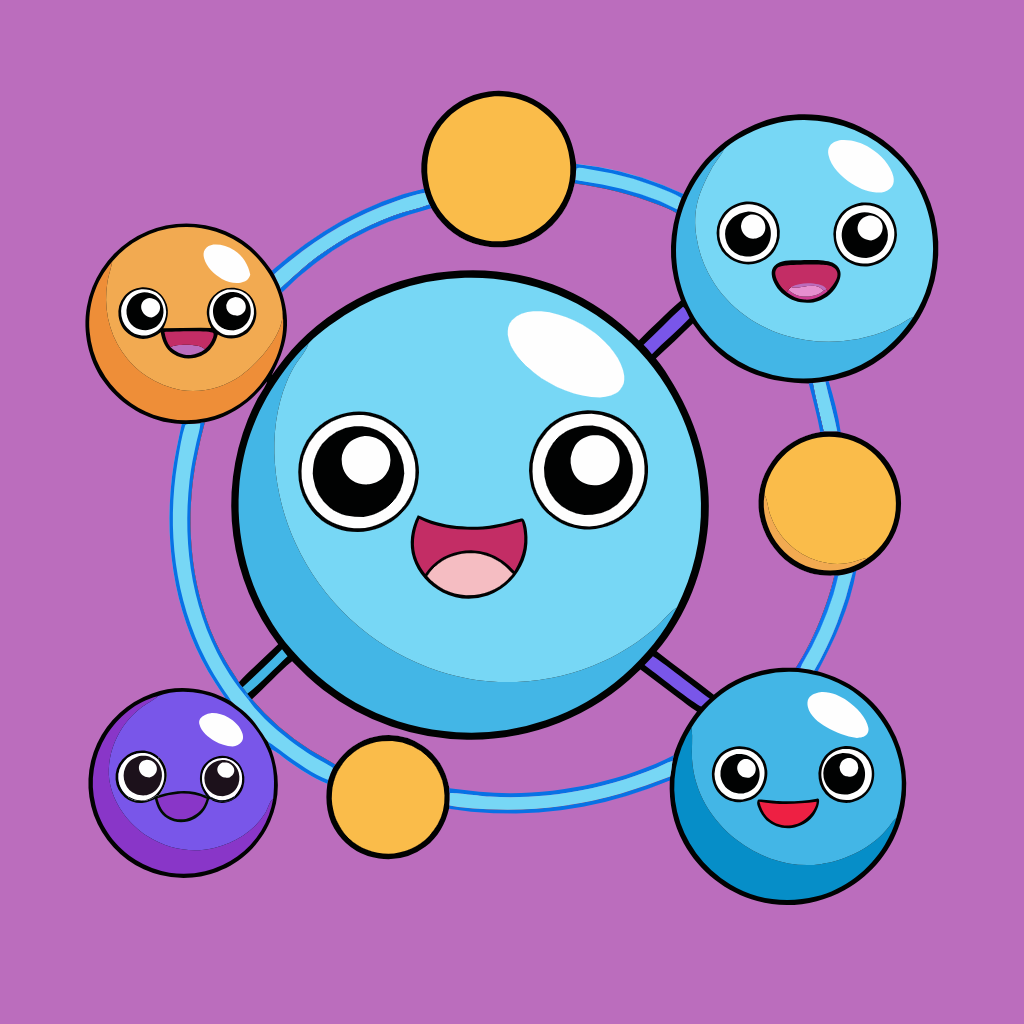
Too Child-like
Happy smiling bubble connected to other bubbles

Too Generic
Central cloud connected to bubbles surrounding it
After going through a few iterations of cute clouds connected to one another, it was too fun and playful, which pulled the design into more of a child focused feeling. I altered the prompts and geared the colorful circles more towards a circuit board look. The color wheel image that I ended up choosing had a dark blue background that grounded it in a techy space. It also had a good variation of color that created a fun aesthetic.
Color Palette
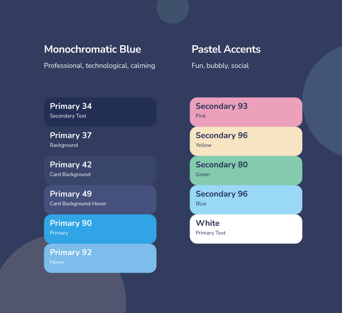
Monochrome and Pastels
Drawing inspiration from the AI image, I used a monochromatic blue color scheme to ground the site in a professional and technological space. I also pulled my accent colors from the bubbles in the image to use in the background to pull in the element of fun that the client requested.
Responsive Site
Desktop Design
Hero Section
Simple to balance out all of the crazy colors and patterns of the image. It balances out the fun element with professionalism.
Feature Cards
Used bevels to echo the detailing in the hero image. I wanted to bting cohesiveness to the cards and the image to help guide the user down the page.
Testimonials
This feature would work as a carosel and allow the user to scroll through all the reviews. If they didn’t want to, it would move on its own. I wanted to add an animation to it to resemble the “you have a message” ping we get on our phones. This feature also continues the bevel design and pulls its colors directly from the hero image. The line behind the review bubbles also helps to connect each one and distinguish it from other sections.
Footer
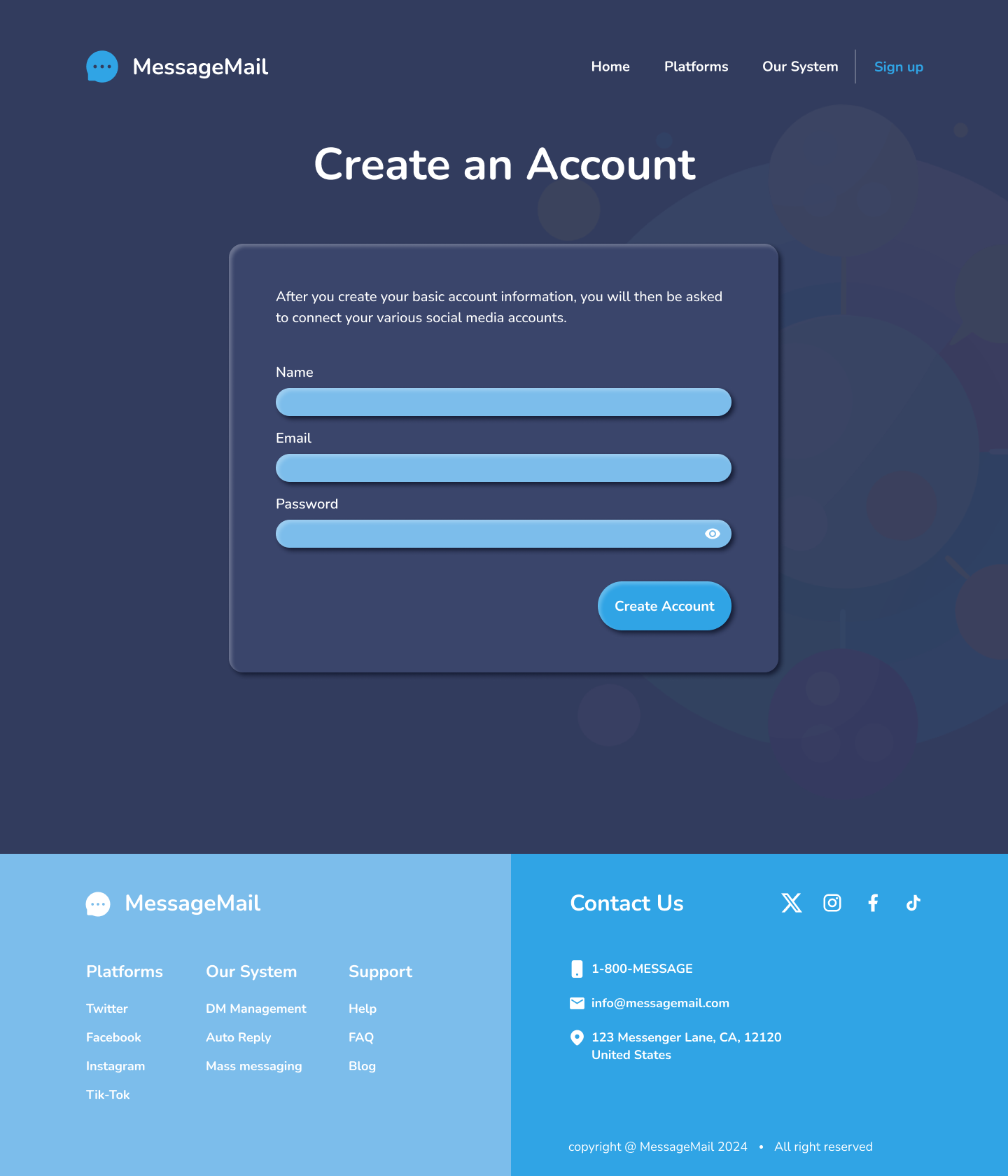
I split the footer into two main colors to represent the user’s social media DM’s coming together in one place. It also creates a visual separation between website info and contact info.
Sign-up Page
I made a simple form that had only had 3 fields to fill out. That way the user has a small barrier to entry. If the user wanted to sign up, they would have had to navigate to this page by clicking “get started”. This institutes the yes ladder- making the user more likely to actually follow through with signing up.

Mobile Design
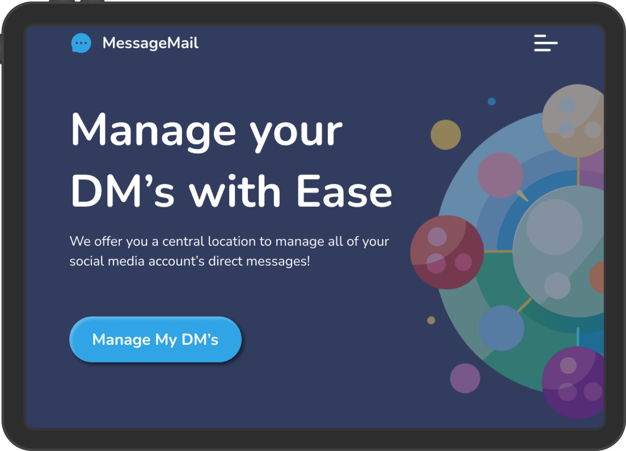
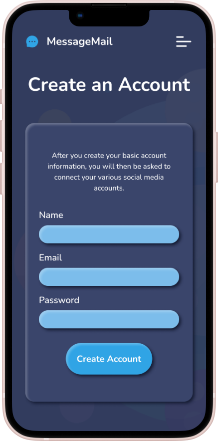
I took all the functionality of the desktop version and simply scaled it down. Most of the elements that I created were responsive using constraints, so I simply just resized them when the screen size decreased.
I had to redesign the nav bar to become an overlay and I had to make specific footers to fit the size of each device type, but it was just a matter of rearranging the content so that it fit nicely onto a smaller screen.
Contact Me
Get In Touch
Reach out to ask me questions, chat about your ideas, or to share some feedback!
