UX/UI Designer
Anika Systems
Project Overview
Landing Page Redesign
Anika Systems is a tech solutions contracting company specializing in federal agencies. They needed a fresh take on their landing page, and I was thrilled to step in with innovative redesign ideas!
Time Frame: 2 days
Team: UX Desinger (Myself)
Original Landing Page
Research Phase
Catering to the Clients
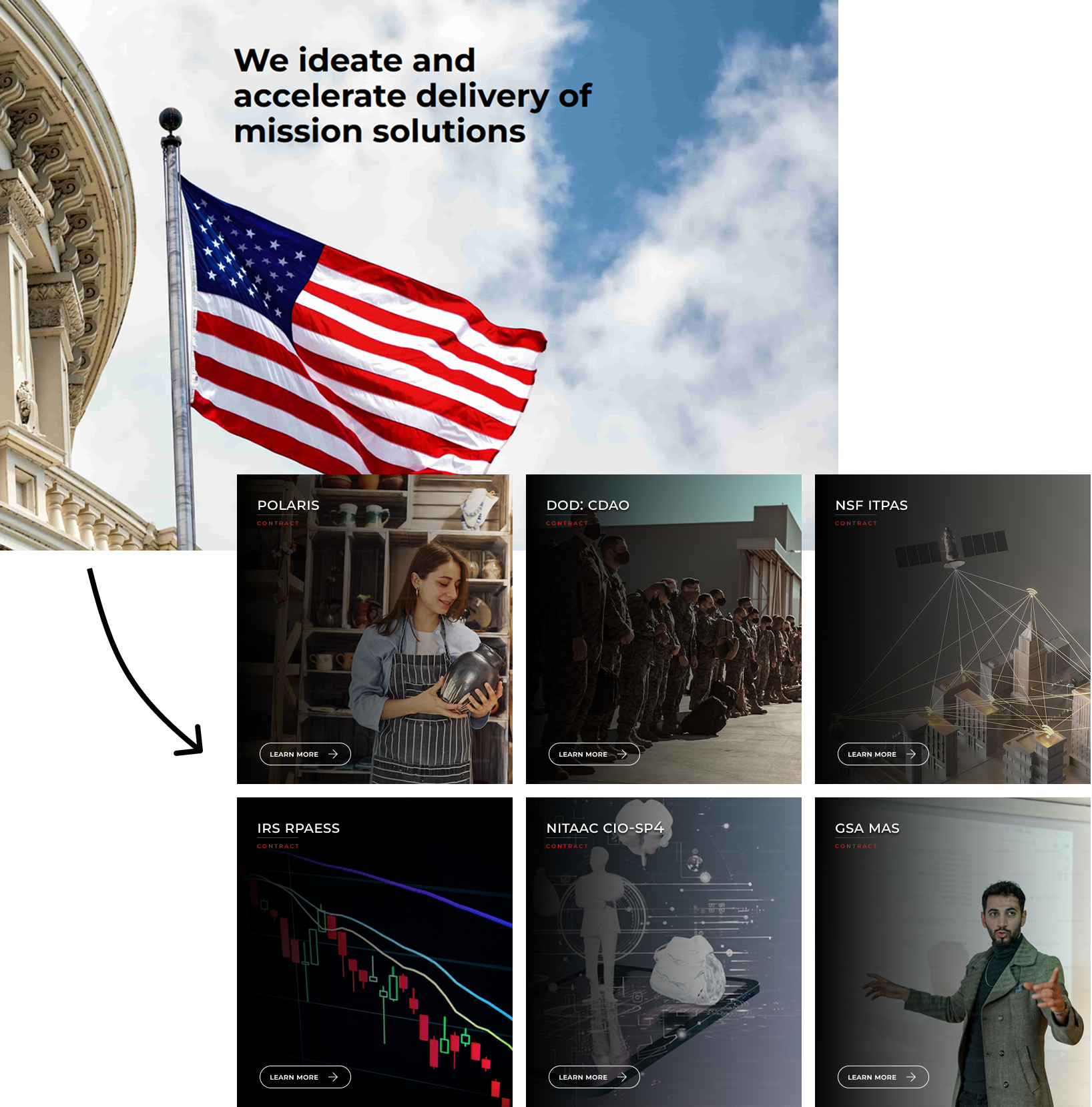
When marketing your services, you need to be able to show potential clients what makes you different right off the bat. Researching the organizations that Anika Systems already has contracts with, such as the Department of Defense, IRS, and National Science Foundation, gave me insight into the clientele.
I needed to deliver something that was professional and high-tech, but also conveyed security and trustworthiness. I really liked how Anika Systems already incorporated imagery of the government on their “Who We Are” page and knew that I needed more imagery to depict the government and the agencies that Anika already works with on the landing page.
Competitor Analysis
Keep it Simple
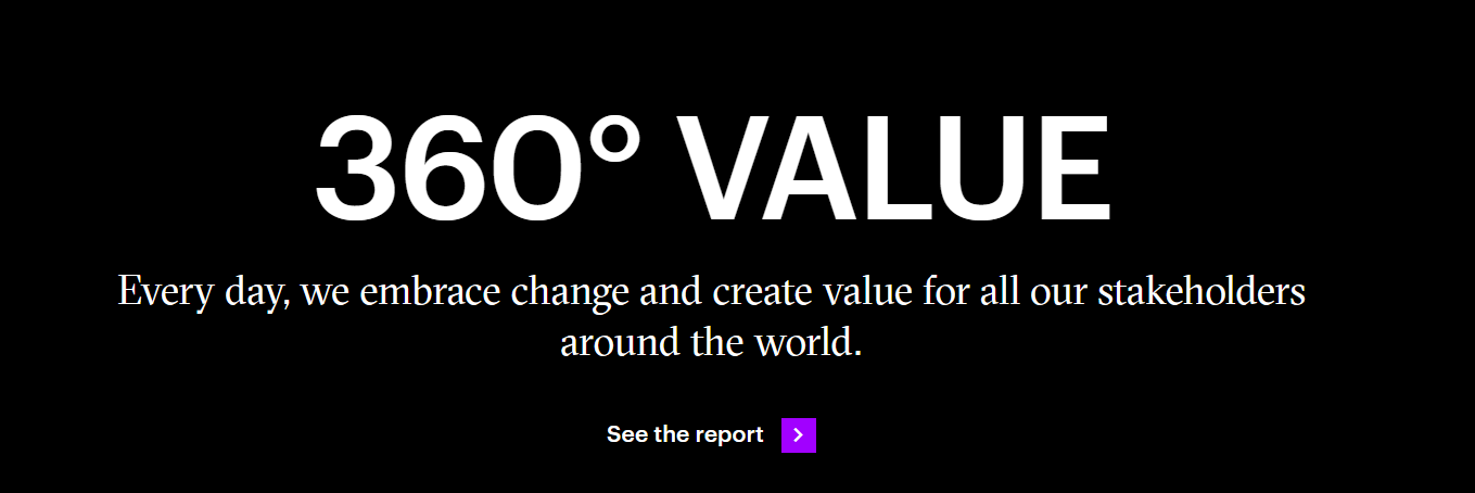
When analyzing competitors, I noticed a few trends. One consistent pattern among Accenture, UST, Reply, Globant, and NTT Data was their clean and simple UI. Each H1 was accompanied by an H2 limited to 1-2 sentences. While this approach reduces the amount of information presented upfront, it allows users to quickly locate what they need without feeling overwhelmed.
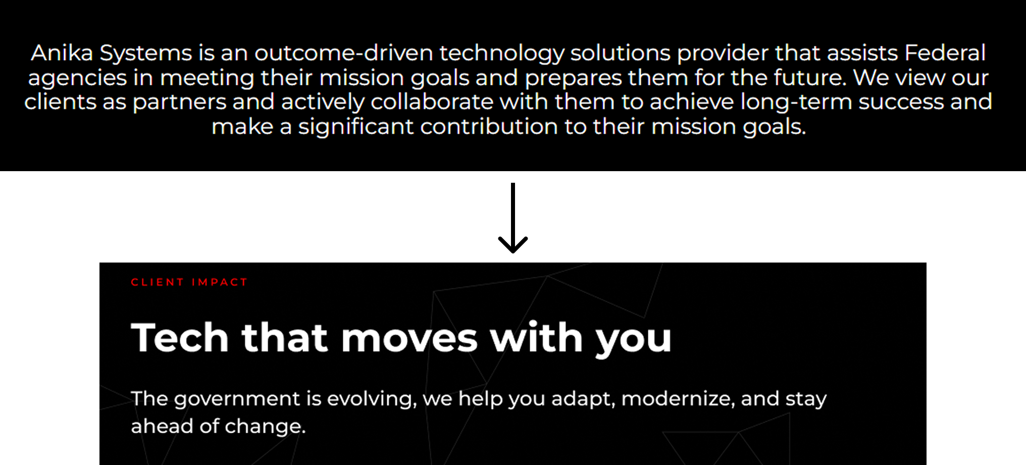
Using these sites as examples, I knew I needed to condense the mission statement to just one or two sentences. I also needed to simplify the services into buttons while maintaining a cohesive interactive experience in the hero section as users scrolled down the landing page.
1. Reduce the mission statement

2. Interactive service buttons
Prototype
Bringing it all together
The main takeaways for this landing page redesign were simplification and marketing. By focusing on these two concepts, I reduced the user workload when browsing the landing page while drawing them in with powerful keywords and client-focused imagery. Additionally, I created a more cohesive experience by extending the interactivity of the hero section throughout the entire page.
The prototype I built serves as a visual representation of the landing page’s flow. Due to time constraints, I chose not to add all of the scrollable interactions. The intended effect was for the services section to highlight each service in red as the user scrolls, drawing attention to them one by one. Another interaction I would have loved to implement was a dynamic scrolling effect showcasing different clients before reaching the footer.
Contact Me
Get In Touch
Reach out to ask me questions, chat about your ideas, or to share some feedback!


