UX/Graphic Designer
Colonist.io
Background
Roadblock in expansion
Colonist.io is an online gaming platform that is focused on bringing board games to the virtual world. They plan to expand to a larger audience via mobile platforms in 2025, although the platform is missing an essential component: Colorblind accessibility.
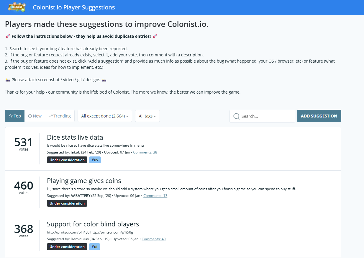
According to their user feature requests from January 2020, as well as a conversation I had with one of their Senior Developers on LinkedIn in January of 2025, this problem has yet to be tackled.
Role: UX Researcher / Designer
Problem
Colorblind Accessibility
Why does this matter? The request is outdated by 5 years, but it is more relavant now than it has been in the past, especially with the expansion of the company to mobile platforms.
300 million people worldwide are colorblind, most of which are men
Who is Colonist’s target audience?
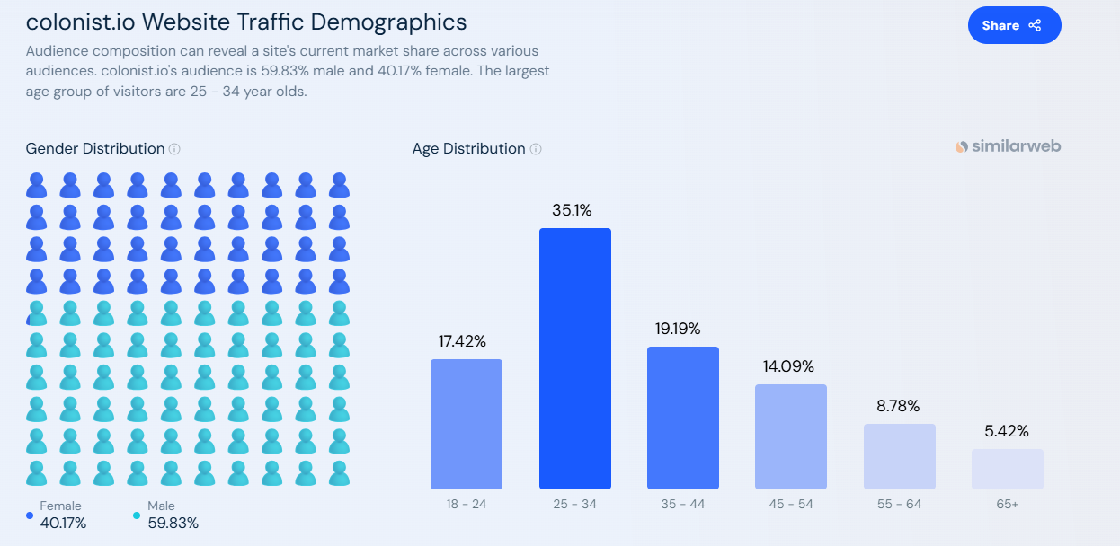
According to similarweb and Colonist, the 2024 demographics are:
- 4.3 Million players
- 59.83% male
- 40.17% female
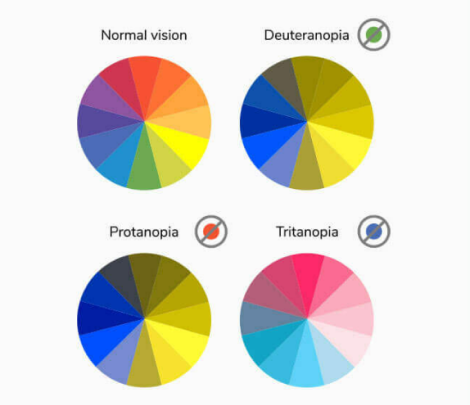
Types of color blindess
There is not catch all color blind palette since there are so many types of color blindness. Here are the most common ones:
Deuteranomoly: Unable to perceive green light
Tritanomaly: unable to perceive blue light
Protanopia: unable to perceive red light
What percentage of Colonist’s players are colorblind?
- 8% of all male players
- 210,601.6 players effected
- .005% of all female players
- 86.37 players effected
Who needs color blind accessibilty?
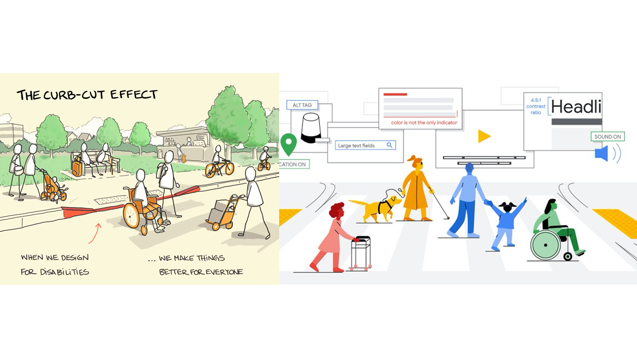
The same way that curb ramps don’t just help those in wheelchairs, but also pregnant women, elderly folk, delivery workers, etc, adding colorblind accessibility will improve the gaming experience at Colonist.io for everyone.
Colorblind Players
- Need contrast to tell pieces and players apart
Normal vision players
- Have to explain who is who to their friends rather than focusing on the game
Other visually impaired players
- Need contrast to tell pieces and players apart
Problem Statement
Contrast
Players cannot differentiate game pieces from the board or from each other leading to confusion and less than ideal gameplay for everyone
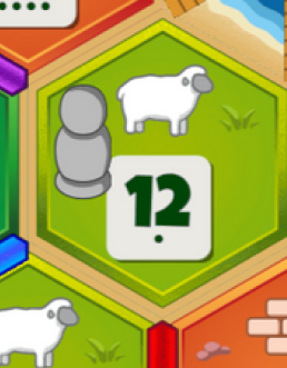
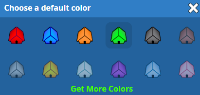
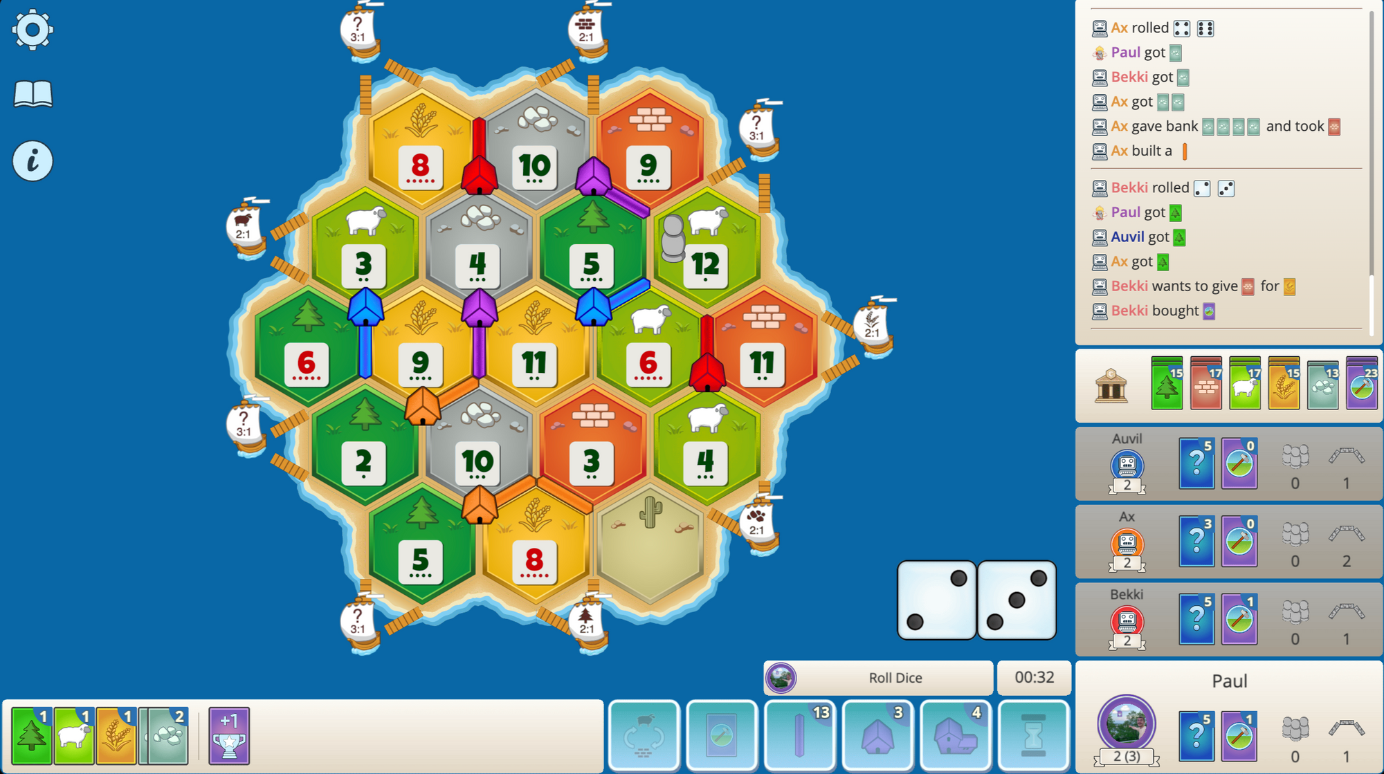
The two main complaints that users have is that they can’t tell the players apart and they can’t see the pieces on the board. This causes an issue for not just the colorblind players but normal vision players as well. Time is being spent not on the game or the strategy but on having to remember which settlements are placed where and what space the robber is placed on.
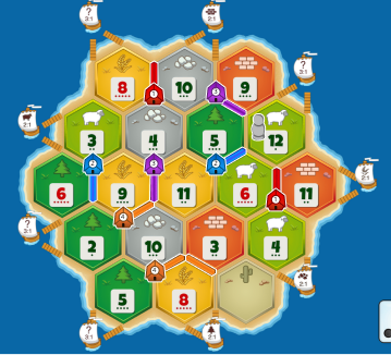
I created user personas based on the actual player feedback to represent these pain points. On the right are photos from the actual game:


Solution
Pros and cons to user solutions
Designing for color blind accessibility is more than just adding a color palette that people can see. It is about contrast and using different elements, not just color, to differentiate. Think about a stop sign, not only is it red, but it is shaped like an octogon and has a white border as well as large white letters that say STOP. You don’t need to know that the sign is red to recognize it because there are 3 other elements to help you do so.
Using this knowledge, I was able to rank and combine the user suggestions for potential solutions.

Colorblind mode
- Many of the users suggested a “Colorblind mode” as a solution
- Does not address the contrast issue that other visually impaired individuals need.
- Increased complexity for development and design teams
Shapes
- No need to be able to count; shapes are universally recognized
- Shapes are not necessarily related to each other, making it more difficult to remember compared to a number system
Arabic Numerals (1, 2, 3, 4)
- Even white space and contrast
- Most commonly used number system in the world
Roman Numerals (I, II, III, IV)
- Not enough white space for optimal contrast
- Less common than Arabic numerals
Roof and Road Patterns
- Adding patterns to the players’ pieces would add contrast
- Contrast provided is not significant enough
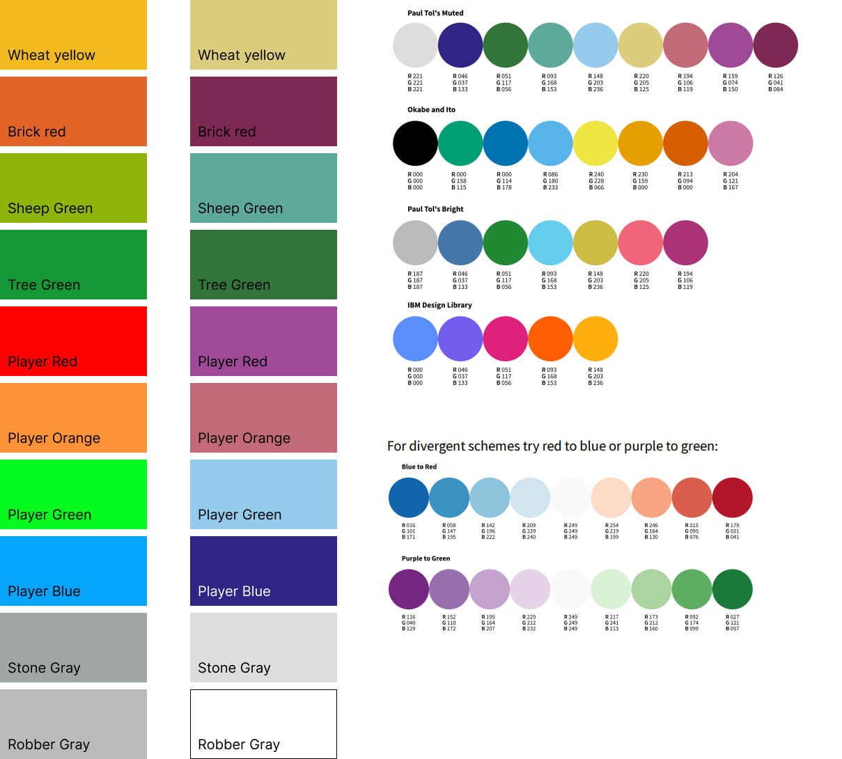
Colorblind mode example using tested and approved swatches for colorblindness
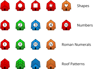
Testing out all of the user suggestions to get a feel for the workload and visualize the contrast
Results
Borders and Numbers
Using colors from the actual game, I put some reds, greens, and yellows together to see how much contrast I could get. Using the implementation of a number or a shape on the settlements was not enough, and it didn’t work for roads either. I thought about the stop sign example again and knew that adding a white border around settlements and roads would give the extra contrast they needed.
This border could also be added around the Robber game piece, and this would only be a small stylistic change for the designers of the Colonist team to implement and possibly add as a global style to all game pieces.
I arranged the suggestions from most least favorable to most favorable considering accessibility and then ease of development. The most accessible style would be adding numbers (Arabic numerals), which is also the easiest implementation for design and development. I placed numbers higher than shapes because they are more cohesive.

I also built a mock-up of what the outlines might look like in the game with both a light border as well as a dark border. The lighter border fits the bright aesthetic of the game a little bit more and provides contrast while looking cohesive with the rest of the board. The darker border provides contrast but makes the game look a bit muddy and is disjointed from the rest of the color scheme. I also tried using black as well as the green color that the numbers on the resource spaces have, but they yeilded similar results.

Lessons Learned
Accessibility in Design
Implementing a solution that would solve more than one problem is be the key. More people are affected by an issue than just the ones who bring it up. In this case it was not just color blind players but also other visually impaired players and sighted players.
Scoping the issue to allow for the quickest and easiest solution for design and development increases the company’s success. The less time that it takes for a feature to be implemented, the more time the company is able to spend working on more content to give to their users.
Contact Me
Get In Touch
Reach out to ask me questions, chat about your ideas, or to share some feedback!
